Articles on this Page : |
||
Accessible Sign DesignWe put our expertise and experience to use in our signs. And like anything, the difference is in the details:
|
Font & Typeface FAQ
The term "font" today refers to an alphabet of letter shapes of the same style. Historically, it included only one size set of letters, but since most typesetting is done on computers today, the size of a font is easily changeable, and the term has come to refer to the style, regardless of the size of the letters. The terms "typeface" or "typestyle" usually mean the same thing today. If you want to learn more about these terms, and other terms used to describe letters, there is an excellent glossary of typographical terms with examples available on Microsoft's website. Serifs are decorative points or strokes on letters in some fonts. "Sans serif" simply means that a font's design does not include serifs. Because a serif is an embellishment to a letter's shape and not an integral part of the letter, it can be eliminated and leave the letter intact.
Consider this example:
Both lines of text are spaced properly for tactile reading. Notice how the bottom line of serif characters had to be spaced widely, particularly between the R and the A. This extra space makes the word hard to read by sight, and the serifs make it hard to read by touch. Compare this to the top line. Without serifs, the letters "sit" next to each other better visually, while keeping their tactile readability. While not perfect, it is still much more readable by either means. You certainly could, but font selection is a crucial part of design. Locking yourself into one font, even one that's "perfect" for tactile reading, closes a lot of possible design doors. There are many fonts that read well by touch; there is no need to limit yourself to just one. Can I use lowercase letters? Not for tactile letters. There are too many variations in shape among lowercase letters, even in sans serif fonts. Uppercase letters have more easily recognizable shapes, even with slight variations between fonts. This is why the ADA guidelines call for only uppercase tactile letters. What weight of font should I use for tactile letters? For most typestyles, to meet the ADA guidelines, a "medium" or "semi-bold" weight will give you the proper stroke-to-height ratio. Keep in mind that when engraving the letters, most fonts will lose a little weight, and when embossing or etching the letters, most fonts will gain a little weight. Check the finished product, not the original artwork, to make sure it complies. If the signs have Braille, why do they need tactile letters too? Braille is the most efficient way of reading by touch. However, if someone becomes blind later in life, which is more common than being born without sight, that person may never learn Braille. He or she would probably, however, already know the shapes of basic uppercase letters, and can distinguish them by touch.
|
|
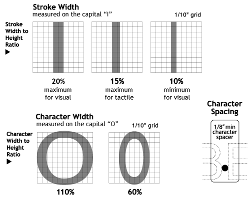
Typestyles, Character and Stroke Proportions and spacing for Tactile Characters (2013) The 2010 ADA/ABA requires tactile characters to have a maximum stroke width, measured at the top surface of the character, of 15 percent. Measure character stroke width and height with the uppercase character "I." California has the same requirement. New federal character widths are from 55 percent minimum to 110 percent maximum of character height. California has a more stringent minimum for character width of 60 percent. To measure, the widest part of an uppercase letter "O" should be used. If the characters used for measurement fall within the parameters of the code, the entire font is presumed to be compliant. The 2010 ADA/ABA now follows California and ANSI, and allows sans serif typefaces only for tactile characters. The most readable tactile character is sans serif, uppercase, with the character width as close to 110 percent of the height as possible, and with a stroke that is wider at the base and beveled or rounded to no more than 15 percent of height at the top surface. The 2010 ADA/ABA requires something new: spacing between characters. In tactile signs, each character in the same word must have a minimum of 1/8 inch space between the two closest points, measured at the top surface of the characters. When characters are both visual and tactile, beveled or rounded characters can have as little as 1/16 inch between the character bases.
|
Combined California & Federal Rules (Most Stringent):  |
|
 |
|
||||||
| About Us | Job Gallery | ADA Information | ADA Resources | Online Store | Contact Us | Downloads |


