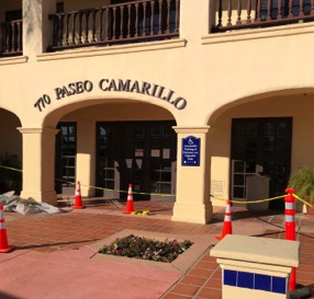
A California Certified Access Specialist asked us to solve a difficult exterior wayfinding problem. There were limited ways for someone in a wheelchair to access this beautiful Spanish Revival building.
Even though this was an exterior wayfinding project with only three doors that required tactile identification signs with braille, we applied our ABC guidelines. For visual signs, that meant text readable from a reasonable distance, accessible for people with mobility based disabilties who also had some vision limitations.
The text is understandable by people who might have some cognitive problems, or whose hearing does not allow them to ask directions or hear the answers.
Because this building is so beautiful with such unique details, including cobalt blue tile surrounding some entrances, we didn't want the usual aluminum signs with wheelchair symbols and chunky arrows. Not only for accessibility, but for legal compliance as well, we provided non-glare surfaces and non-decorative type. The finished signs are layered, with a shape that echos the arches and features cobalt blue and stylized arrows.
For the exterior entrances to three suites we had no reason to prepare visual signs, since the existing signs met our visual requirements. Therefore, we used our new "touch-reading only" font, accompanied by braille, for small suite number signs applied to the sidelites next to the entrance doors. You won't see a photo of those, since -- yes, they are almost invisible!
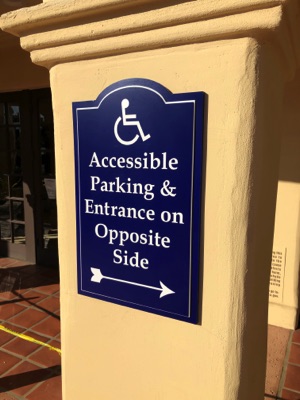
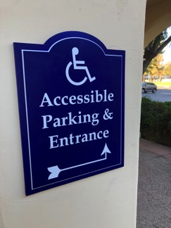
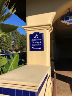
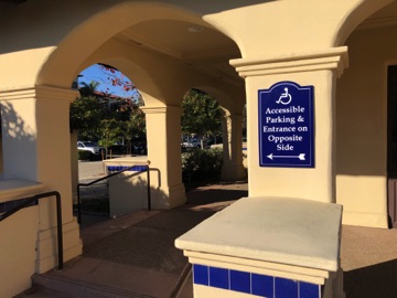
Exterior Wayfinding Signs for a Spanish Revival Building
